In August 2025, the agency Kreatives (Munich) reached out to me to work on an explainer video for the Milano Cortina 2026 Paralympic Games. Seven illustrators were selected for this series, commissioned by the International Paralympic Committee (IPC) in partnership with Allianz, each assigned to a different sport.

My role was to create the entire visual universe for Para Cross Country: sketches, storyboard, character design, backgrounds, illustrations, and color palette integration. Each illustrator developed their own illustration style, while a highly precise visual identity system ensured overall consistency across the series.

Ten days, flat out. Five days to create and validate the full pencil storyboard, integrate feedback from the agency, the committee, and Para Cross Country technical advisors – then five days to apply color and deliver conforming files.
Kreatives’ brief? The best I’ve ever received in my career. The subject alone was fascinating, but the brief itself was exceptionally detailed, with clear creative directives: stylized realism, soft gradients, cinematic compositions, intentional negative space.
Visual references were carefully argued to guide our creativity rather than constrain it. In a nutshell: reinterpret vintage ski posters through a contemporary lens. All of this, paired with a limited but generous color palette – just enough room to play and create bold combinations.

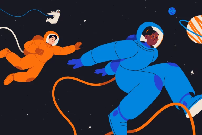
Reading through the brief and its creative constraints, I immediately knew how I wanted to portray the Paralympic athletes: as superheroes. My goal was to represent different types of disabilities in a realistic, respectful way, while giving each character a distinct personality.
I wanted to avoid generic representations. So I gave one athlete a stylish haircut, another a relaxed attitude, someone a cool headband, someone else a small earring for character. Small details that add texture and make each person genuinely interesting.

I also immersed myself in a sport I was discovering for the first time. I watched videos, studied photos, and tried to understand how athletes actually practice Para Cross Country depending on their specific physical profile.
I observed how visually impaired athletes are guided by their partners, the different ski-chair designs that exist, and how skiing technique varies depending on which limb or limbs are absent.
hroughout the project, especially during the sketching phase, I kept one core intention in mind: express raw energy, the joy of gliding, and the drive to push beyond limits.

The sketching phase was intense. Capturing the energy of movement, building dynamic compositions, creating rhythm, anticipating transitions, designing minimalist yet evocative backgrounds, finding the right pose for each character, failing, trying again.
My mirror neurons light up when I draw bodies in motion, and I’m fairly sure I developed a few new muscles during this project. Once that phase was signed off, it was time for color.

“Color” is an understatement. After the freehand pencil work in Photoshop, every shape had to be rebuilt as a vector in Illustrator. This wasn’t simply coloring in – it was a meticulous process of isolating each thigh, calf, elbow, forearm, hand, one by one.
Every element is independent, designed to give animators the flexibility they need to create smooth, realistic, fluid movement.

Then came the final stretch: naming and organizing layers across all my files. Around fifty layers per illustration. Invisible work, but essential – it’s what allows the animator to work efficiently and bring these characters to life convincingly.


The result: around thirty pencil sketches (including a few uncontrolled wipeouts that only I ever saw), about twenty final vectorized illustrations, hundreds of layers, and above all, the deep satisfaction of working with a seasoned team that gave me the creative freedom to truly enjoy myself within a very precise framework.
And with that, the shared pride of contributing to a project of this scale – and the collective energy that comes with it.

On this project, as with most demanding ones, I put myself in the right conditions, much like an athlete preparing to perform: give your best, in your best time.


Friends sometimes ask me: “But how did you land such an amazing contract?”
Let me take you back to summer 2024, just before the Paris Olympic Games. I set myself a challenge: draw one female athlete per week. To practice, to improve, to depict what matters to me. In June 2024, I didn’t have the ease in character design that I have today. But I could see the difference week after week – I could watch myself grow.

Keeping that series going to the end was hard. But it gave me drive and hope. And today, people call me to do what I love most.
So to every creative pal reading this: show the world what you want to be called for. Challenge yourself. Train like athletes do. Whatever the outcome, I genuinely believe it always leads somewhere good.

Agency: Kreatives
Executive Creative Direction: Tony Gui, Franzi Sessler
Art & Creative Direction: Tainá Ceccato Animation: Andreas Maris, Bruce Morrison, Luca Brandovardi, Simon Tibbs
Editing & Sound Design: Andrés Cajas
Storytelling: Tony Gui, Janina Engel
Client:
International Paralympic Committee @paralympics: Jonas Oliveira, Kiriah Walter, Davis De Lutiis
Allianz @allianz: Ana Shapiro Queenan, Tobias Gruenewald, Ralf Schreck, Thomas Lippl, Travis Black