
For several months, I have been taking private English lessons. To practice and improve my spoken expression, my teacher and I talk about branding at every session. It’s the common ground we’ve found.
One day, I showed her the before/after of Google‘s icons. At first glance, the redesign rolled out quietly, with no big announcement. And yet, looking closely, something had changed in a fundamental way.
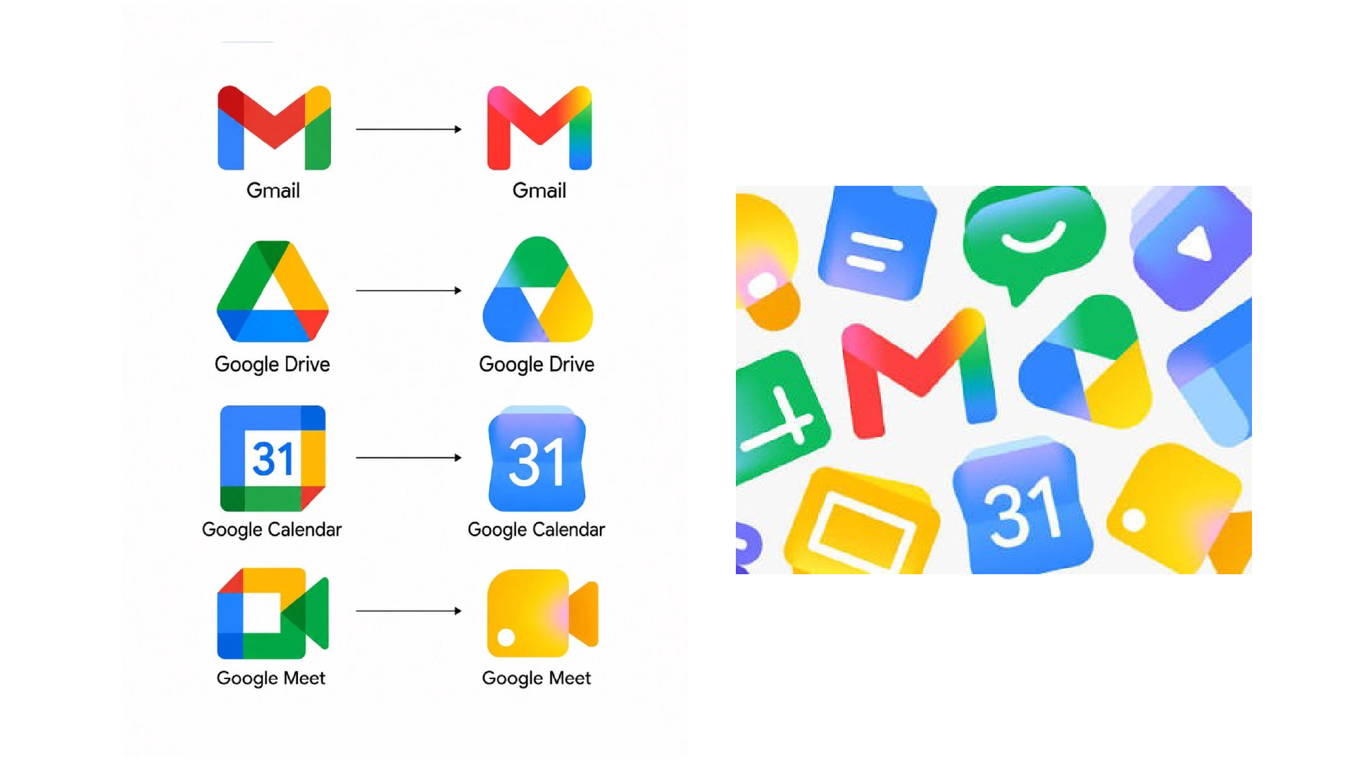
Pink. A new shade of light blue. Gradients. Rounder shapes. The removal of flat, layered blocks of saturated primary colours that had defined Google’s visual system from the very beginning.
Red, blue, yellow, green. For decades, primary colours were considered the universal visual language — accessible, recognisable, valid for every audience. Brands reproduced them out of habit and reflex.
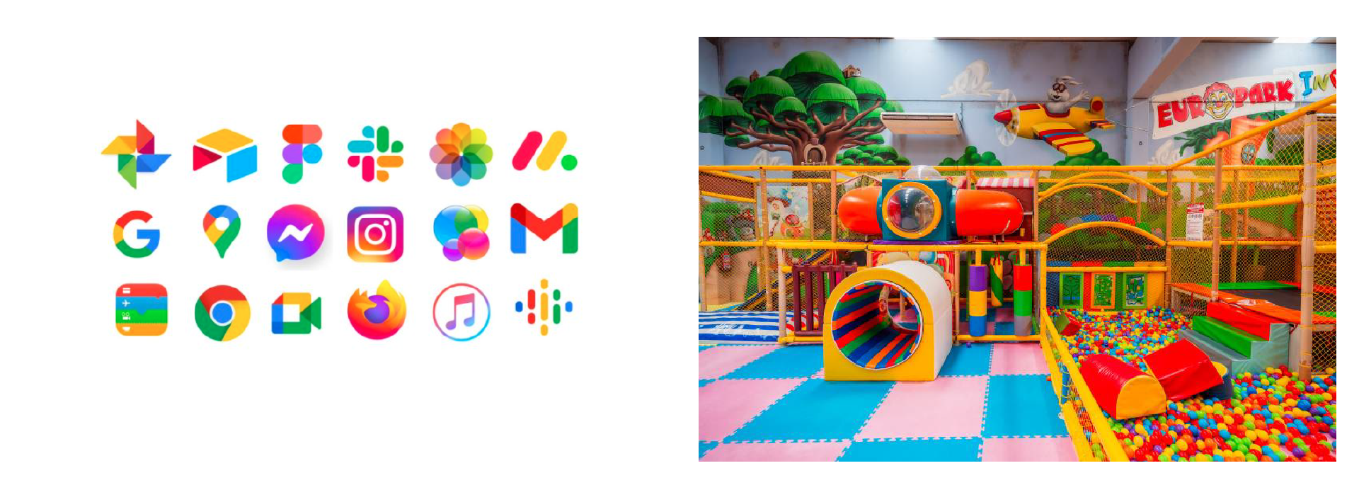
In other words, Google quietly touched all of that. The new palette gained nuance and light; something softened. As a result, it evokes more of the sensoriality of childhood. Something more subtle. When one of the most recognisable brands in the world changes its founding colours without a word, it’s safe to assume there is a fully deliberate direction behind it.
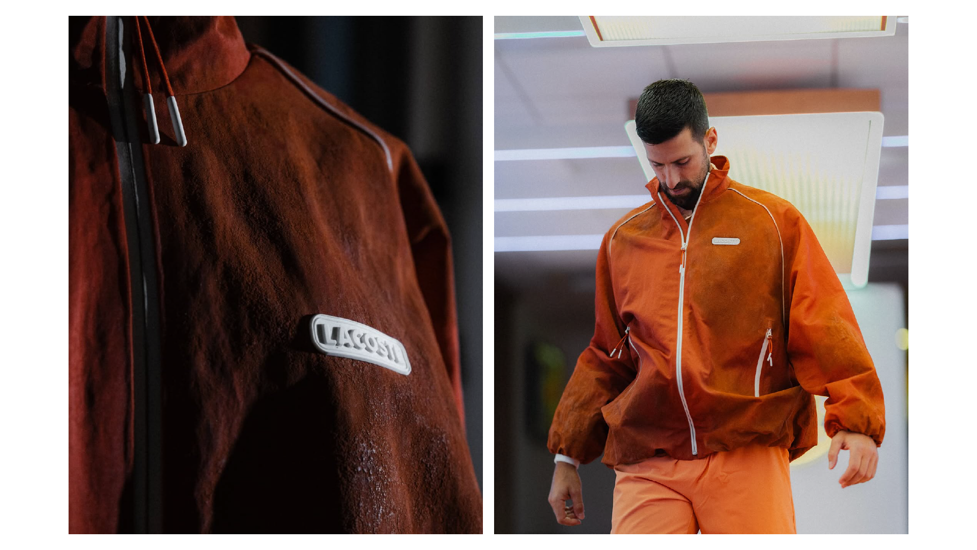
In a different register, during Roland Garros 2026, Lacoste dressed Djokovic in a jacket made from clay, the court’s own surface, used as pigment. A one-of-a-kind piece, seen by millions, that said something precise: The jacket literally comes from the court. Rooted in the real, concrete and deliberate. The logo evolved too. Lacoste returns to a serif typeface, to forms with more character and personality than its competitors, riding the wave of the brand’s embodied authenticity and history.
What Google does with its hues and Lacoste with its clay, it’s the same formula: infusing the tangible into the intangible. Reintroducing body, gesture and material into brand territories that are most often experienced through screens. A strategic decision, entirely grounded in the present.
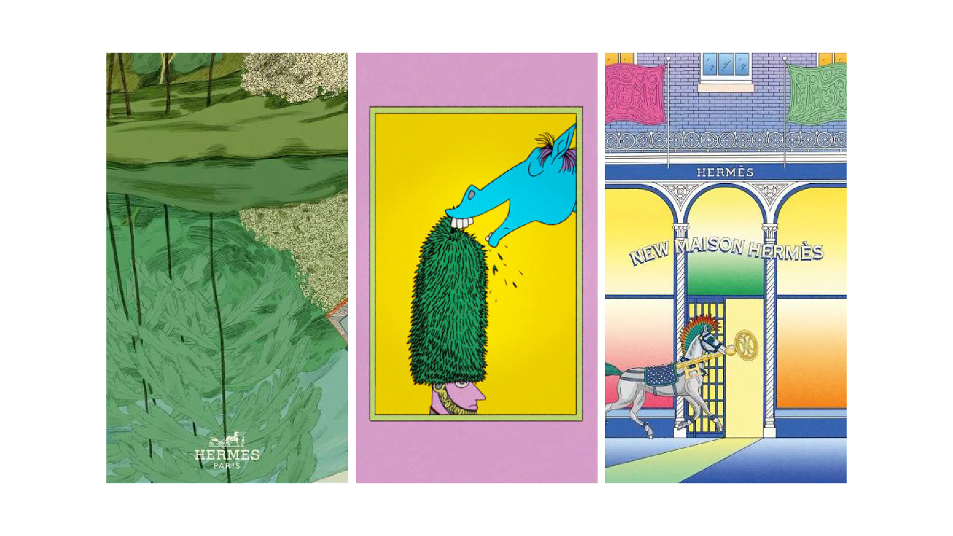
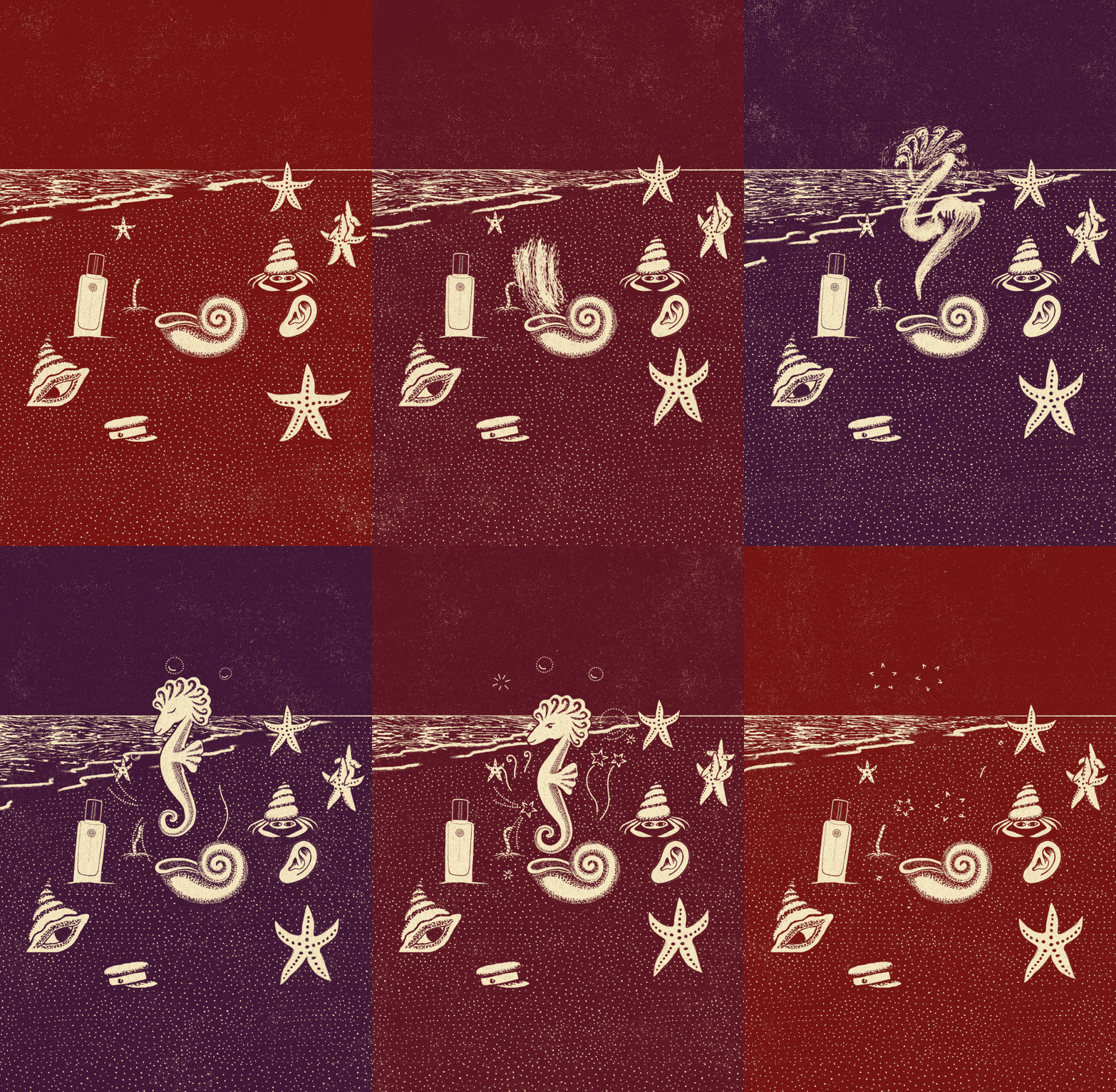
Hermès has used illustration, craftsmanship and gesture as its founding positioning for generations. What other brands are experimenting with today, Hermès has been practising since 1837. By June, the house had already commissioned a remarkable number of artists, illustrators and animators for its campaigns that year.
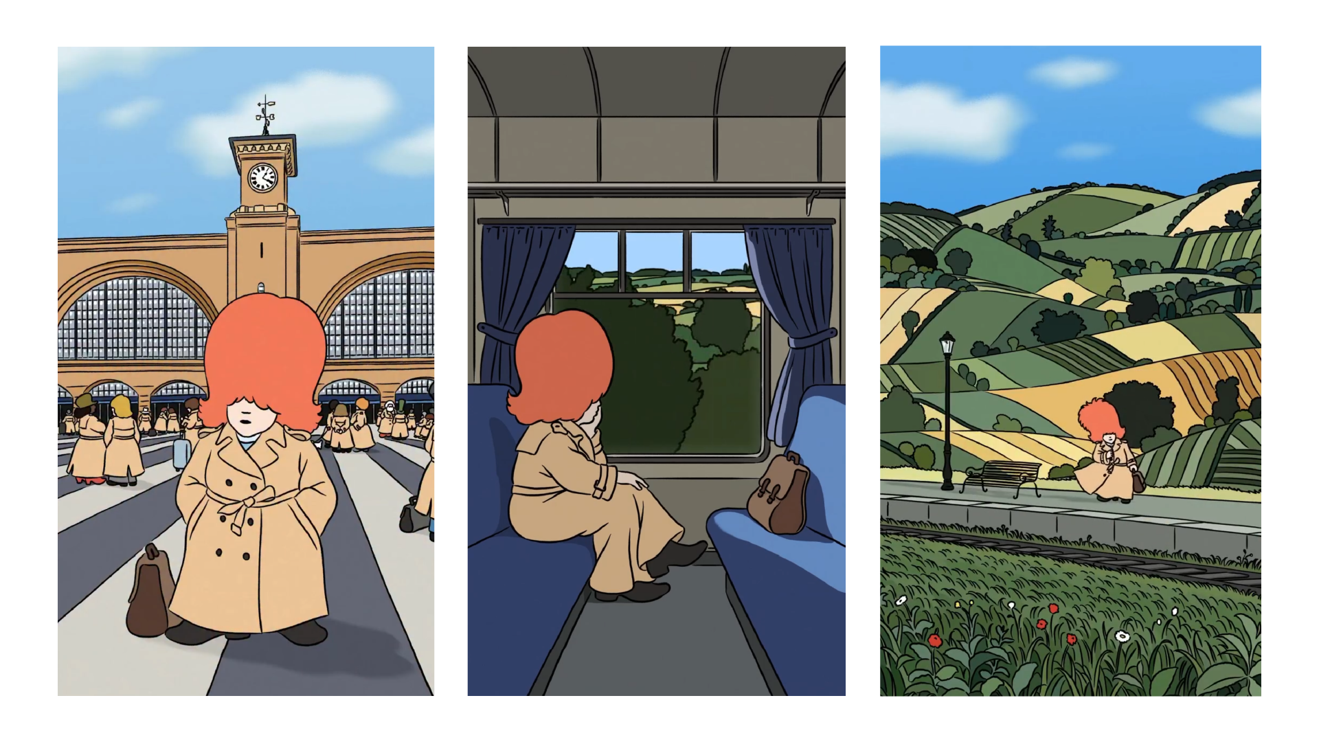
Burberry, for its part, has been developing a stream of richly illustrated, narrative and whimsical Reels on Instagram that cut through the usual visual uniformity of fashion feeds. A signal that’s settling in. When luxury and sport look in the same direction at the same time, that’s worth paying attention to.
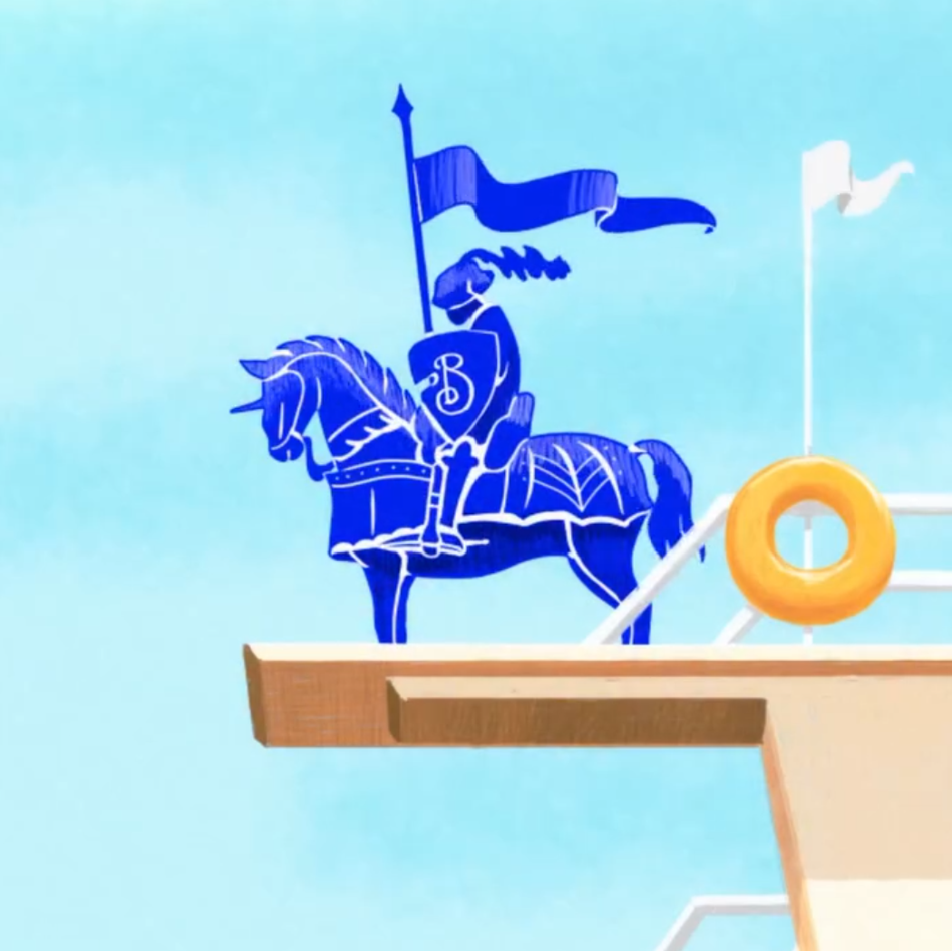
What Google, Lacoste, Hermès and Burberry each show, in their own way, is that product and technique are secondary. What counts is the decision to foreground a human gaze and a human gesture in a landscape where the feed has largely flattened out.
Choosing illustration is taking a position, exposing a creative point of view. In a stream that’s uniformising at speed, standing out involves a degree of risk. I don’t think illustration is a magic formula. But I notice it works when it’s carried by a clear brand strategy and a confident creative direction. Choosing the right illustrator is part of that decision, and it’s the part I find most interesting.