For a long time, LinkedIn was for me the unfun interface by definition. The platform of obligatory congratulations, of “thrilled to join the adventure” posts, celebrating everything, all the time, with the same calibrated enthusiasm. I struggled to see any real use for it, let alone to contribute anything genuine.
When my strategic partner, Claire Lemaitre-Smith, suggested for the tenth time that I give it a real chance. “You know, it could actually be really good for your visibility.” I pulled a face.

Then one day, scrolling through my feed, something stopped me. Someone in my network was starting a new role, not exactly the news of the year, but the image accompanying the notification was fresh, alive, singular. Nothing like the generic visuals I associated with the platform.
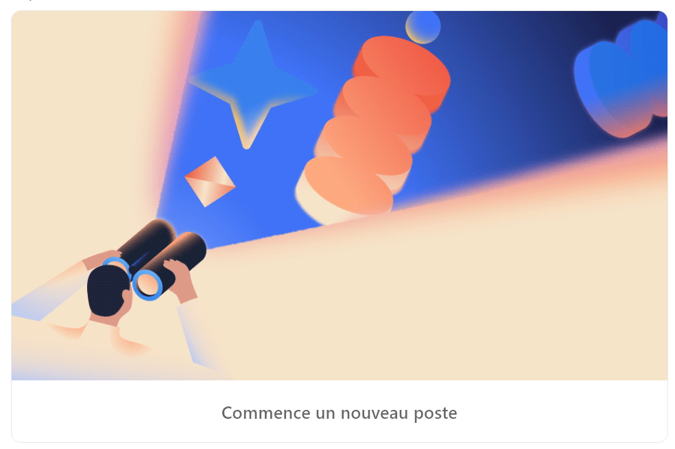
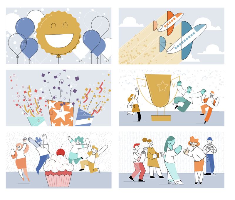
I looked up who made it. It was the team at Buck, a studio I’ve collaborated with several times, including for Google, on projects that all share a common thread: bringing interfaces to life to create a positive emotional response in the people who use them.
What struck me about these illustrations was that they worked without forcing anything. They had a presence, calm, precise, that made the LinkedIn feed feel more alive. Just shapes, poetry, characters, a clear intention.
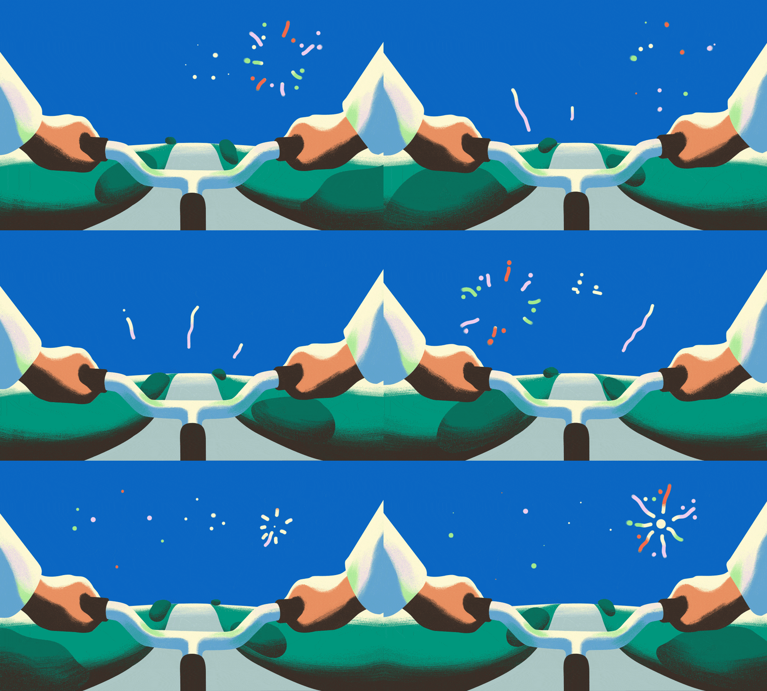
What Buck had pulled off is something genuinely hard to calibrate: images designed for a billion users, across dozens of cultural contexts, capable of making almost everyone feel something, almost simultaneously.
The key lies in a few deliberate choices. The characters are stylised, the proportions deliberately exaggerated between figures and the objects around them. That choice, leaning into abstraction rather than realism, focuses all the attention on emotion and atmosphere.
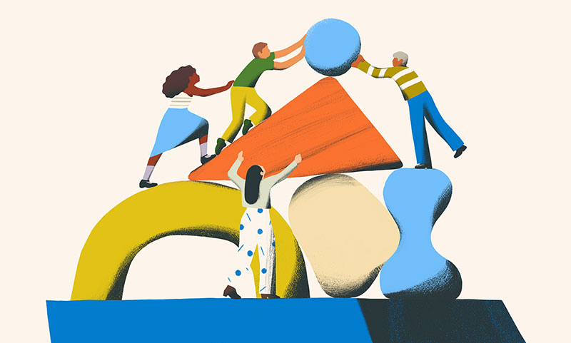
The figures become inclusive and symbolic, untethered to any particular identity. Anyone can recognise themselves in them; no one is defined too narrowly. Every character gesture, every visual metaphor had been tested to be understood intuitively, regardless of the user’s cultural background, industry, or story. A kind of universal illustration.
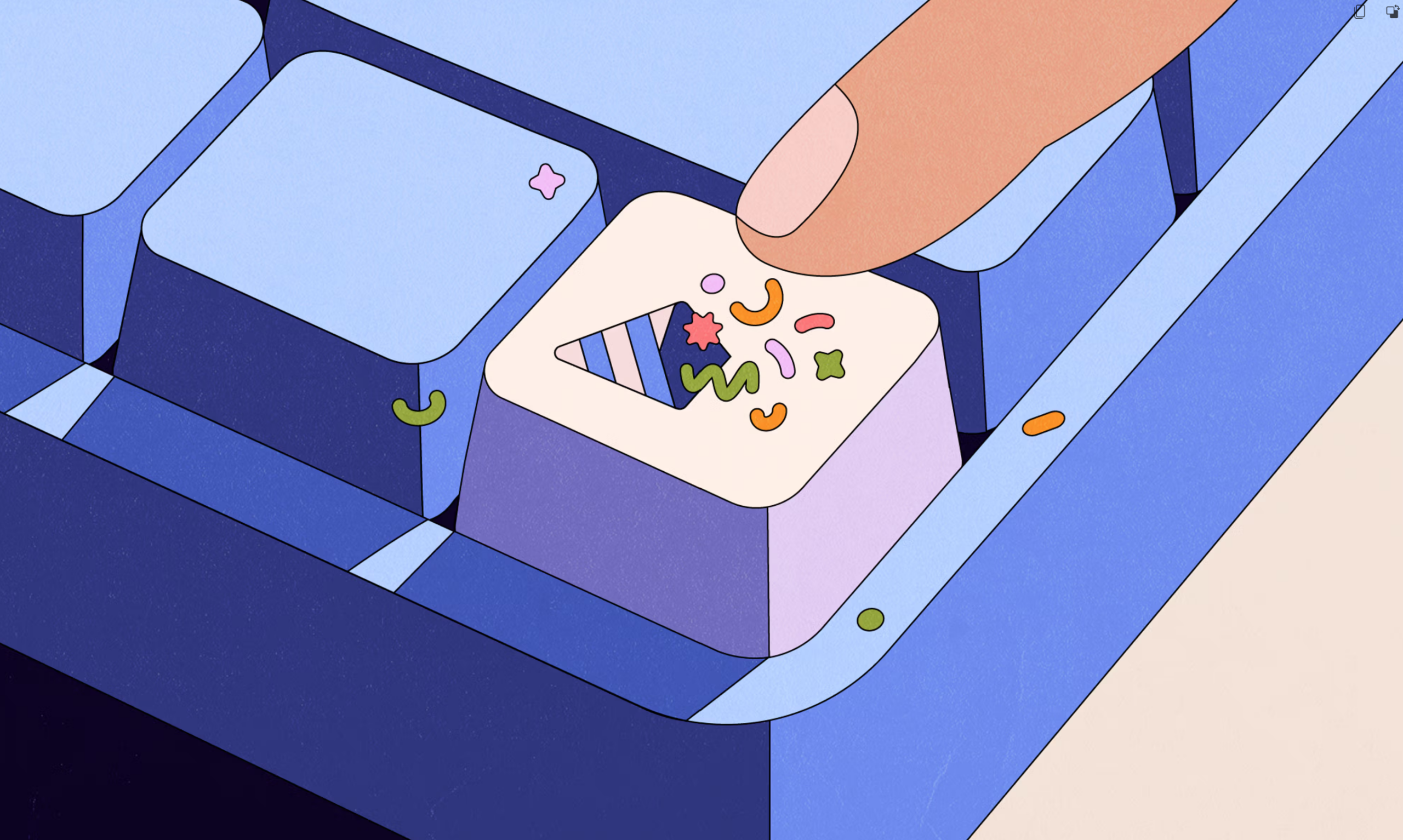
That same logic shaped my work on Google Contacts VIP, a Google Pixel widget designed to help users stay connected to the people who matter most to them (birthday reminders, significant dates, quick access to close contacts from the home screen).
My role was to illustrate the different moments of this widget: important dates, empty states, onboarding screens. Fixed illustrations, designed to live inside an interface, in a user’s daily flow on their phone.
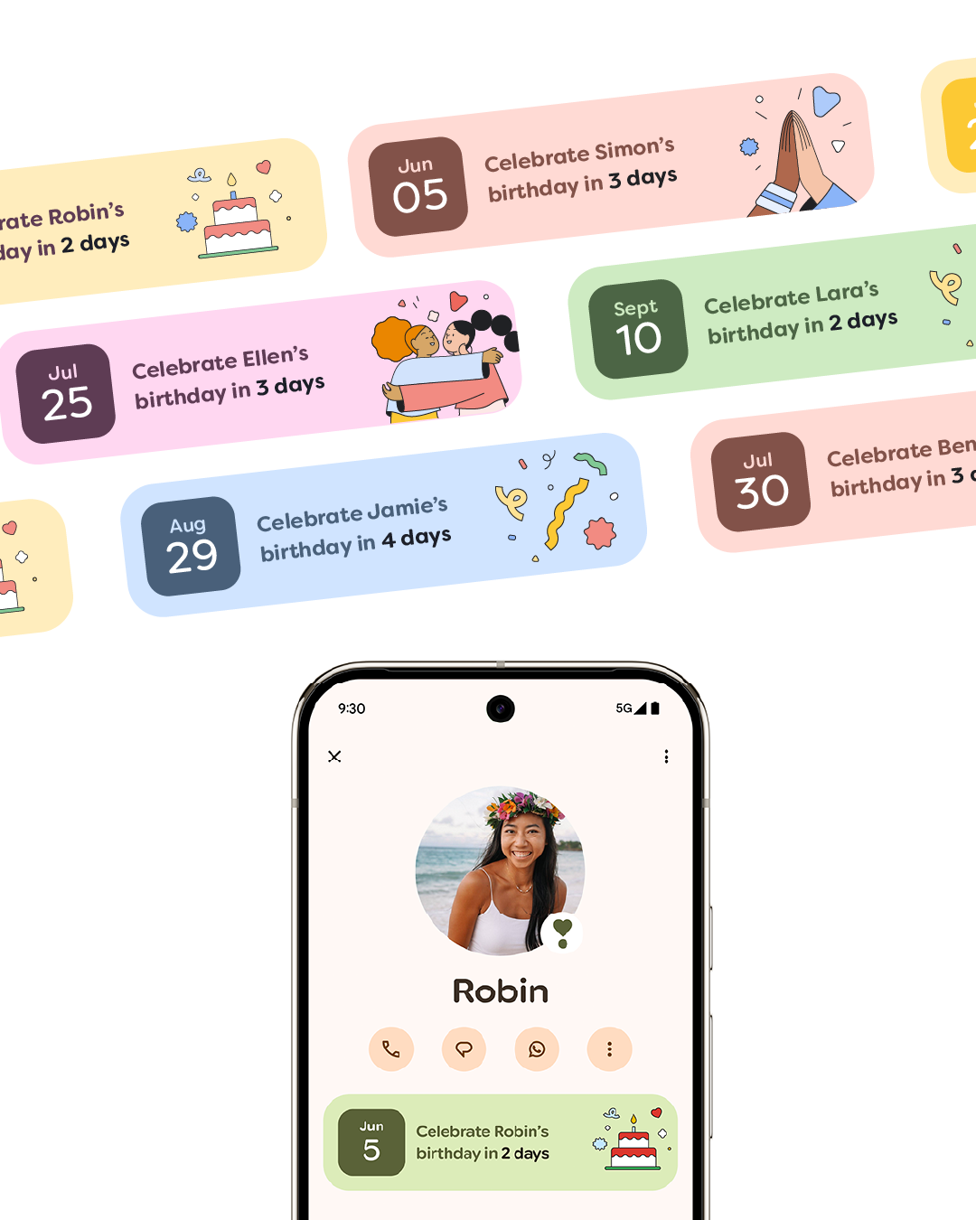
This kind of project is particularly demanding because an interface illustration doesn’t have the luxury of time. It has a few fractions of a second to work. When someone discovers the widget for the first time, everything happens fast: recognising it’s Google, sensing something new, wanting to know more. That’s not an abstract mechanism: it’s exactly what the illustration either triggers, or doesn’t.
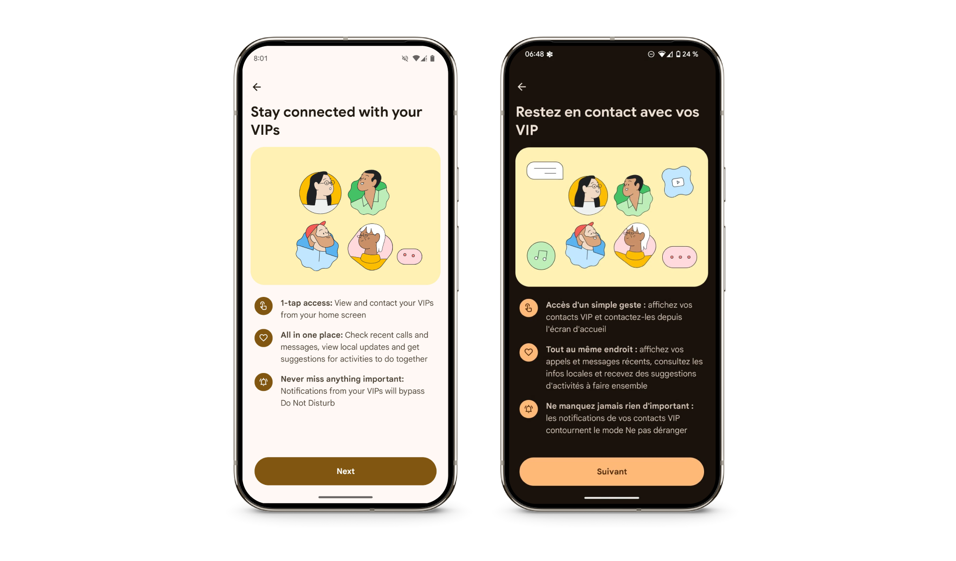
The goal, put simply: to lead the user to think this looks simple, and it’s useful to me. That sounds straightforward, but it’s the entire challenge of this kind of work.
On this project, I worked within Timo Kuilder’s visual territory, bringing my own style and sensibility to it. The brief was deliberately open: a reference, a palette, geometric shapes, and one instruction: make the illustrations live in the same world, without replicating what already existed.
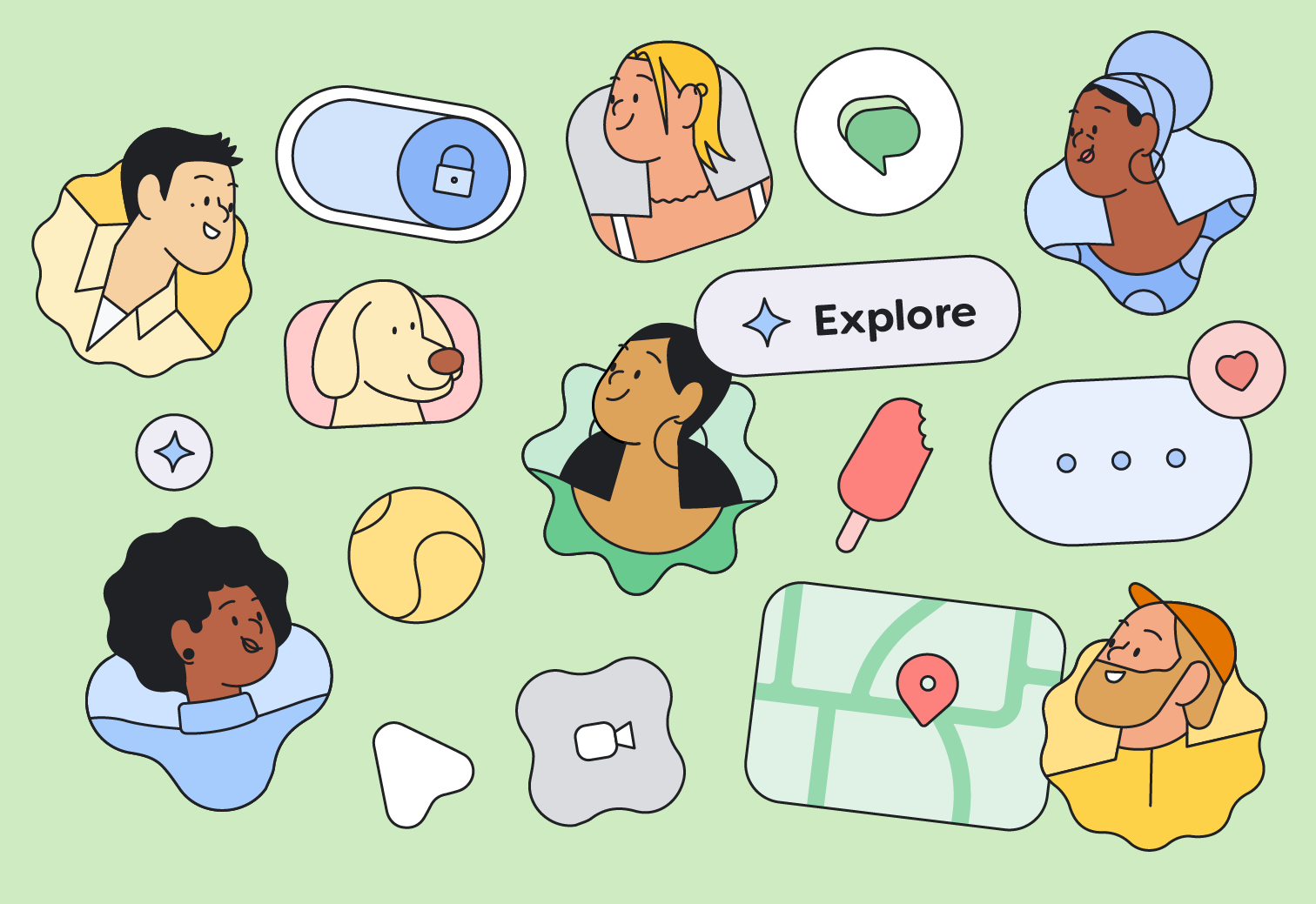
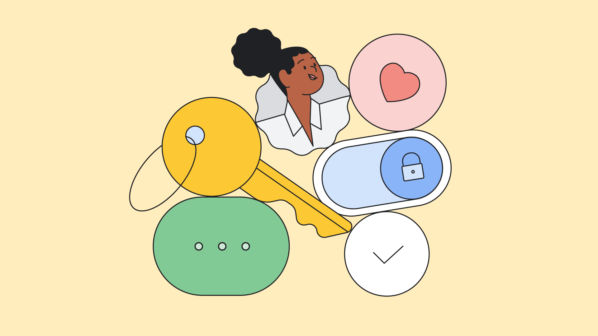
I built characters diverse in age, gender, and skin tone. But representation wasn’t the only question. It was also attitude, energy. Characters that give off something: a warmth that comes from their expressions, a sense of community in the way they inhabit the space. The same principle as Buck’s LinkedIn illustrations: an abstraction that leaves room for the universal.
That’s what a good illustration does inside an interface: it makes a moment a little more human, a feed a little more alive, a connection a little less automatic.
That’s what Buck did for LinkedIn. For Google Contacts VIP, working with them, same logic.