
Back to creative roots! MAIF reached out to illustrate their quarterly magazine for members. A chance to reconnect with editorial illustration — but with a very different approach from my early days with Libération or l’Obs.
If my early professional years led me to illustrate often serious subjects with gravitas, this new collaboration gave me the freedom to explore a much lighter tone!

The brief
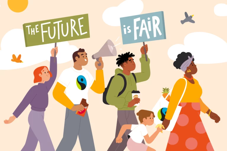
Create a series of 17 vignettes to accompany articles and testimonials, from insurance fraud to responsible life insurance.
The goal? Bring a touch of lightness while respecting the serious nature of the subjects. Complete creative freedom on style, with a single constraint: incorporating MAIF’s signature red.


The creative approach
This project let me continue my exploration of freehand drawing. Moving away from Illustrator’s vector precision, I favored a more spontaneous, organic line in Photoshop.
The result: illustrations where the roughness of the outlines and small imperfections bring warmth and authenticity. These “imperfections” give life to the characters and create a more natural connection with the reader.


The small format challenge
Working on vignette formats required a specific approach: thicker lines to ensure legibility, simplified compositions for immediate understanding.

The characters, with minimal accessories, needed to be instantly recognizable. This format constraint pushed me to strip things back, to find the right shape to tell the story at a glance. A stimulating exercise in synthesis that taught me to trust simplicity.

Making insurance accessible
How do you tackle serious subjects with lightness? By playing with disproportions! A scale with an oversized fruit, enormous binoculars, a circle of characters gathered around a tiny Earth… These shifts in scale naturally add a touch of humor while serving the message. This approach creates a welcome distance from subjects that can be complex or sensitive.


A concrete example
To illustrate an article on uninsured vehicles, I created a comically dilapidated car, spewing both smoke and banknotes. The exaggeration allows a serious subject to be treated from a refreshing angle, without minimizing its importance.
Through this exercise, I got to explore something I love about my work: finding the creative angle that makes a complex subject more accessible and memorable.


A smooth collaboration
The exchanges with MAIF were particularly efficient: sending sketches, adjustments when needed, then adding color. Despite a tight schedule, we maintained consistent quality across all the illustrations. The trust we built was further confirmed when the project expanded mid-way, with the addition of new portraits.


The adventure continues!
My creative approach particularly resonated with the MAIF team, as reflected in their feedback:
“First collaboration with Clémence, which went very smoothly: great chemistry, easy communication, understanding, responsive… She has a lot of talent, we were very satisfied and won over by her work, delivered on time too!”


This successful first collaboration paves the way for future illustrations in upcoming issues of the magazine.

With trust
This project for MAIF confirms something I’ve been noticing in my practice for a while: the more relaxed I am, the more creative I get, and the more my illustrations connect with their audience. This project gave me the perfect space to keep exploring a more “loosened” approach — one that prioritizes gesture over surgical precision.
I love seeing how my style adapts naturally to different contexts, whether for a startup, a magazine, or an outdoor campaign.
One thing is certain: this creative exploration is only just beginning.