
Sunday evening at home, on a friend’s recommendation, I watch the broadcast of the France vs. USA women’s basketball final.
Since I don’t know the rules, I look up how the scoring system works, and I’m off! The edges of the court, surrounded by LED panels flashing in every direction, are so bright that I almost miss all the three-pointers the French players sink in the second quarter. Then comes an advertising break that feels identical to the first and leaves me with a sticky sense of boredom. When the interlude ends, I find the players again, along with the need to concentrate on the game so I don’t get swallowed up by the giant 3D pizza dripping behind the athletes’ silhouettes.
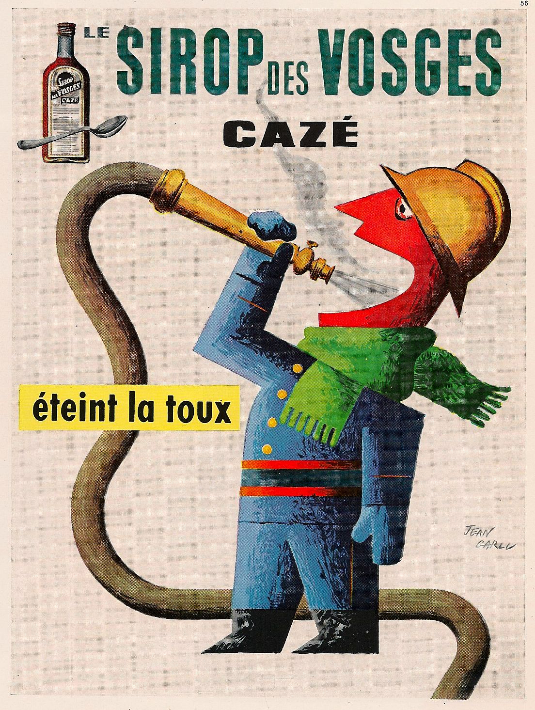
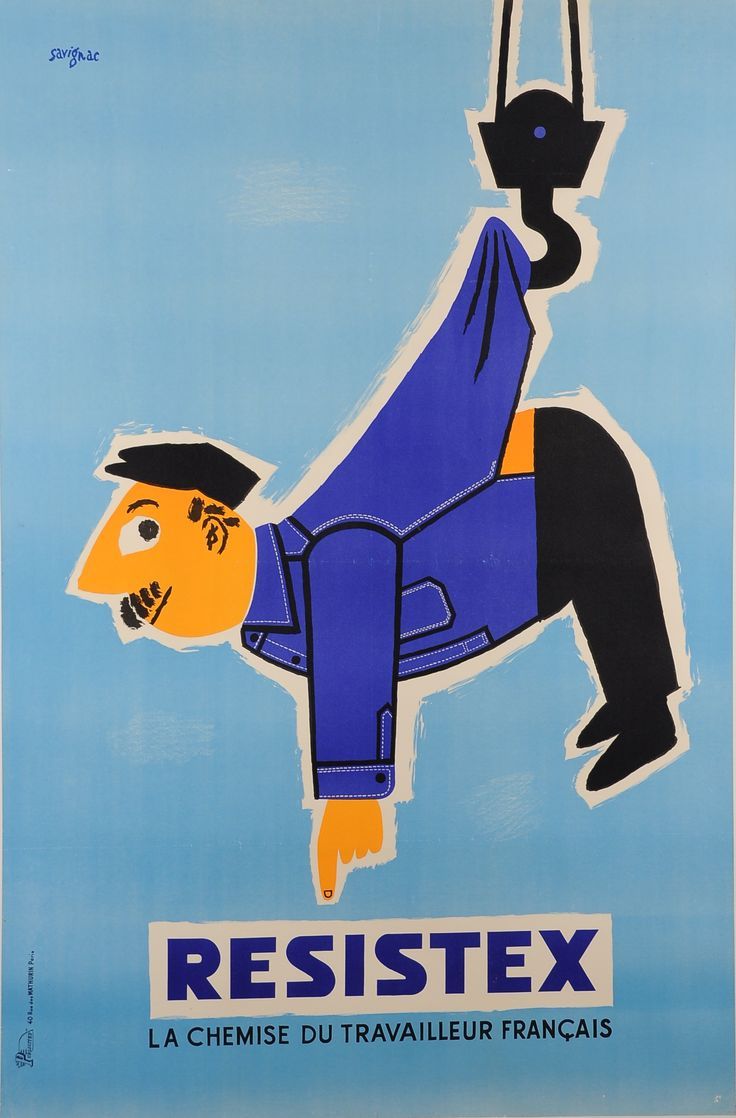
A few days earlier, I had been searching for images of illustrated advertisements from the 1940s to the 1970s. My partner had encouraged me to investigate this period after reading an article about the visual creativity of the decades before the 1990s, with the underlying message being: why were things better in the old days?
I didn’t read it, but I was curious, so I spent three hours browsing frantically and joyfully through a whole collection of advertisements, each more captivating than the last. My affinity for visuals and typefaces, which I shared in my post Design Inspiration #3 – Typography Snacks, expanded to include advertisements aimed at my parents’ and grandparents’ generation.
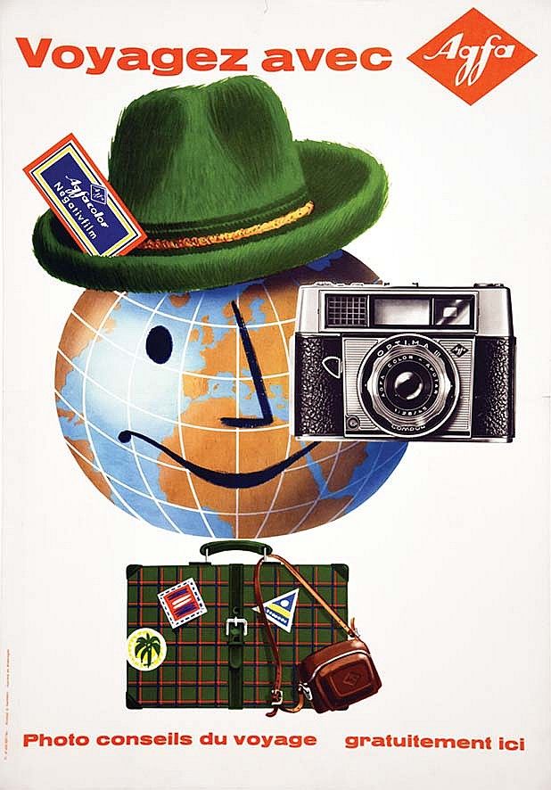
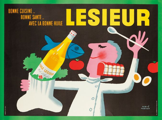
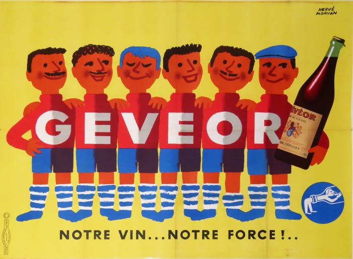
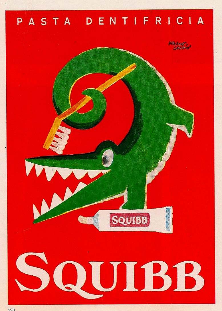
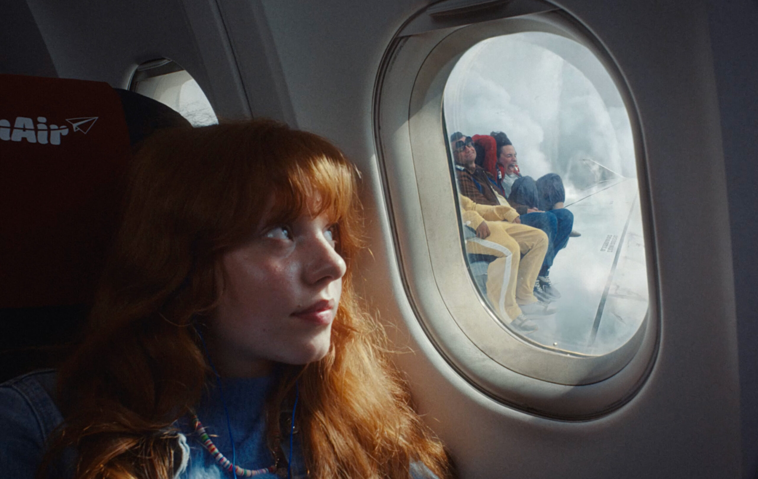
Back to the game. The third ad break. One commercial stands out, promoting a well-known energy provider. The concept is fairly simple: a heroine experiences one absurd and disastrous situation after another, with each unpleasant surprise punctuated by the ironic line, “Didn’t anyone warn you?” at the end of the commercial, the brand claims the opposite: with them, there are no surprises, except discovering that it is cheaper than expected. It is completely absurd and very funny.
I also read in an article that Eva, the heroine, has been the central character in the brand’s commercials for some time. The brand has thus built a sense of continuity that makes its relationship with the audience feel familiar, like a series whose next episode you eagerly await.

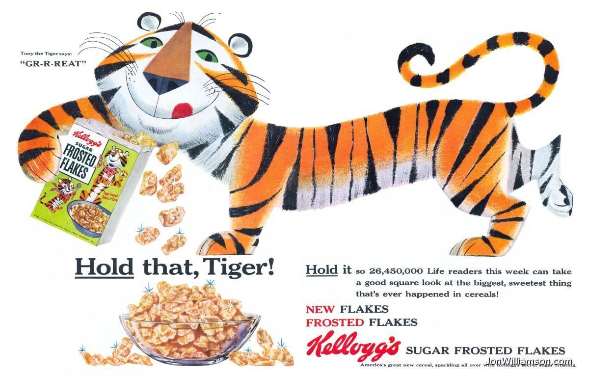
During the game, I also noticed a green 3D rooster making its way around the court on the LED strips beside the players. He was the one who distracted me most of all. I barely saw the French team score! By association, I remembered the cereal brand’s super cat, which has evolved over time while retaining an incredibly endearing attitude and design.
Just like Eva, the electricity-provider character, this big feline is part of an ongoing narrative, but also embodies fun and encouragement. All of this makes him a lovable figure. For younger viewers, he is the imaginary friend and accomplice of basketball stars, inviting us to take on challenges with the energy of a tiger.
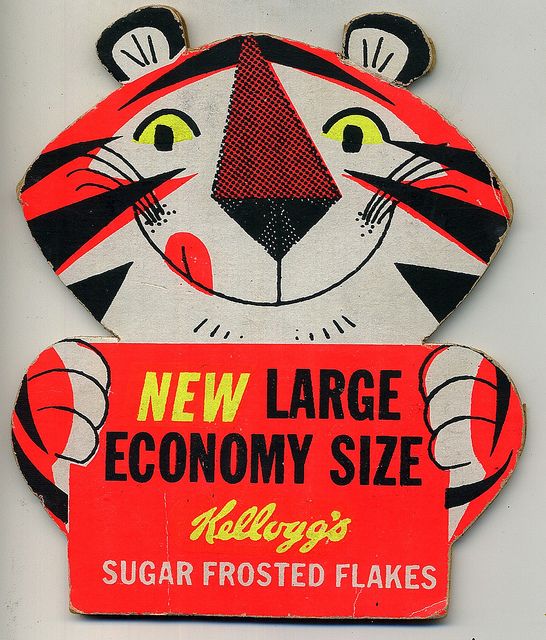
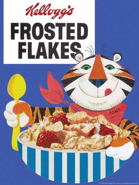
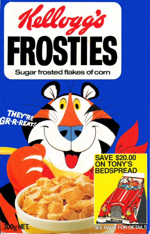
Although I wasn’t able to fully enjoy the game, what I take away from the experience are my digressions and associations of ideas, as well as the renewed pleasure of digging through the creative work of the past in search of inspiration and originality. These visual and creative detours summon the imagination and a sense of fun. Perhaps that is what I am looking for between two quarters…